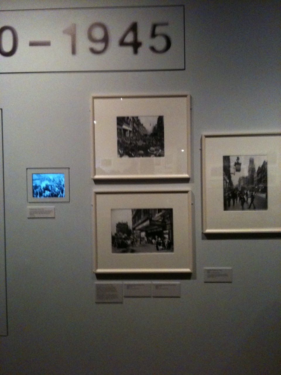
 To the Museum Of London to see their exhibition of London Street Photography. The pictures, which start with tiny, murky pictures from the 19th century and end with large, colourful shots from the 21st, are displayed around one large room. The information about the picture - what a hack like me calls the caption - is placed well below the picture and is often stacked on top of information for the picture below (right). This means that even a shortarse has to look up to see the picture and then peer down, often into near darkness, to see that this picture on the left is of recruiting sergeants photographed near Westminster Abbey in 1877.
The exhibition designer, like 95% of designers since the dawn of time, will no doubt say that it's important not to clutter what is essentially a visual experience with distracting type. I would counter, like 95% of editors since the dawn of time, that an event like this is meant to be read just as much as it's meant to be looked at and that if you separate the caption information from the picture you reduce understanding and enjoyment by 57%. (I made that bit up.)
It's the same in magazines. If given their head 95% of designers will make the pictures as big as possible before stacking up all the caption information and squirreling it away in the corner of the page. The posher (or the more amateur) the magazine the greater the chance that this will be the case. It's something that never happens in picture magazines like Hello or Heat because they know that when people look at a picture they immediately want to know who, when, where and why. Ideally they want to get all that information at once, not in a tiresome double movement.
I don't expect exhibition designers to follow exactly the same discipline but there's something to be learned, particularly in spaces where the low light makes anything but 24 pt illegible.
By the way, I learn from an 1877 book about street life in London that in those days all recruiting activity took place in an area near Westminster Abbey. Fascinating piece about it here.
There's also usually too much information you don't need and not enough you do.
ReplyDelete"Golly, that's amazing. It turns out this work was done on an 8.24-inch-square piece of paper, instead of the wardrobe-door-sized triptych panel I thought I was looking at. And it's certainly reassuring to know that the Paradox Gallery, Ulm, have been so good as to lend it. I'm also grateful to learn, via that helpful parenthesis, that Ulm is apparently in Germany. But what's it supposed to be? It looks a bit like a badger. What do you think? Are you getting a badgery sort of vibe? But, hang on, those smudgy bits are little horn stubs, aren't they? It's probably a cow, then. Or Hellboy on all fours, perhaps. The title - Neuronal Diaspora #6" -doesn't really make it clear."
Have you ever been to the Kelvingrove Museum in Glasgow? It's the only such establishment that I've visited that actually seems to want to make the entire contents of the building accessible to all ages/heights, and seemingly is completely absent of snobbery or stuffy, impractical conventions.
ReplyDeletehttp://www.glasgowlife.org.uk/museums/our-museums/kelvingrove/Pages/home.aspx
Is this perhaps something filtering don from "high end" art, where the artists (+ galleries + curators etc) are desperate not to "prejudice" people's "response" to a work. So you call it Untitled, and give people as little information as possible so that they approach it with an open mind. (Is that why "classical" music rarely has titles?) Once that principle is established at the high end, it filters downwards, with the result that anything which aspires to art abandons any audience guidance. And of course, photography always aspires to art...
ReplyDeleteI was most impressed when they re-lit the space gallery at the Science museum so that the shadows of the rockets fell precisely across the labels.
ReplyDeleteThe new Afghanistan exhibition at the British Museum is well captioned, accessible, the right height for wheelchairs as well as everyone else and an inspiring look at the crossroads of the ancient world to boot.
ReplyDelete